US
Case study

Turning Operational Complexity Into an Intuitive Tenant Experience

A ground-up UX/UI transformation of a complex tenant services ecosystem for a leading Dubai real estate and retail group.

Tenant Portal on mobile
ClientA leading Dubai-based real estate and retail group
IndustryReal Estate, Retail & Mall Operations
PlatformSalesforce Lightning Design System (SLDS) + custom Lightning Web Components
LocationDubai, UAE
Our roleUX/UI Design, Service Flow Mapping, Design System & Component Library, Design-to-Development Handover
Delivered byCodelattice, in partnership with Publicis Groupe
StatusDesign & handover complete — in development ahead of launch
TimelineQ2–Q3 2026

Project Overview

Before

Tenants managed lease renewals, fit-out approvals, permits, NOCs, maintenance issues and promotional requests through fragmented, largely email-based processes spanning 12 separate service documents and roughly 30–40 individual workflows with no shared system for submission, tracking or visibility.

After

A single, mobile-first Tenant Portal on Salesforce env that consolidates all 12 service areas into structured, trackable digital journeys from lease and fit-out management to permits, finance, operations and promotions.

Delivered

720+ designed screens & frames · 34 documented service flows · 99 reusable components (24 SLDS + 75 custom) · full Desktop & iPad responsive design · interactive prototypes handed off for development.

720+designed screens & frames
34documented service flows
99reusable components (24 SLDS + 75 custom)
2responsive contexts: Desktop & iPad

The Challenge

The client operates a large, multi-tenant retail portfolio across Dubai, where day-to-day tenant operations — lease management, store fit-out, permits and approvals, financial administration, facility maintenance, sales reporting and mall promotions — had historically been coordinated by email between tenants and internal teams.

To kick off the project, the client consolidated this operational knowledge into 12 service documents, which translated into roughly 30–40 distinct workflows once mapped in detail. The brief was clear: turn this dense, department-specific operational knowledge — previously run through manual, email-based coordination with no digital system behind it — into a single, intuitive web application built from the ground up, one that tenants could use to submit, track and manage every interaction without needing to know which internal team or process sat behind it.

That brief carried a specific set of challenges:

Tenant-facing processes were spread across 12 separate service documents with no shared structure, terminology or system of record.

Even simple requests — a compliance document, a permit, an invoice query — required an email and a wait, with no self-service visibility into status.

Several journeys (fit-out design, MEP submissions, safety inspections, NOC requests) were highly technical and multi-step, and needed to be simplified into a consumer-grade digital experience without losing operational accuracy.

The experience had to be built natively within Salesforce (SLDS) while still feeling distinct and on-brand for the client — not like an out-of-the-box Salesforce console.

The portal needed to work equally well for tenants on desktop and on iPad, given how differently each group interacts with the platform.

Our Approach

Working directly from the client's 12 service documents, the design team led on the project management side to keep design, business stakeholders and the Salesforce delivery team aligned, set out to translate dense operational documentation into a coherent, scalable portal experience.

Lease structures, fit-out approval chains, NOC processes and mall operations weren't subjects the team had deep pre-existing expertise in. This wasn't a familiar domain being reskinned, it was unfamiliar operational territory that had to be understood before it could be designed. That shaped the order the work happened in: understanding came first, wireframes second, and visual design last.

STEP 1

Turning 12 Dense Documents into Visual Flowcharts

The first task wasn't design at all. Each of the client's 12 service documents was translated into a visual flowchart, so the team could see the shape of a process — who does what, in what order, and where a decision point sits — instead of reading it as pages of written procedure. In hindsight, this stage turned out to be the more straightforward part of the project: it built a shared, visual understanding of processes that until then had only existed as text.

STEP 2

Wireframing the Skeleton: The Hardest Part

Before any visual design began, every flow was broken down into a wireframed skeleton, mapping not just the primary path through a service, but every branch it could take. Fit-Out Design is a representative example: a design submission isn't a single form and a confirmation screen. It's a form, followed by a review that could be approved, rejected, or sent back with change requests, each outcome needing its own screen state and its own path back into the flow, layered with the multiple levels of approval the process actually required.

Multiplied across 34 flows and 12 service areas, working through every case not just the happy path was the most demanding part of the project, well before a single screen was styled.

STEP 3

Validating Every Flow With the Right Stakeholders

Each service area sat with a different part of the client's business, leasing, fit-out, permits, finance and operations each had their own stakeholders and their own view of how a process should work. Rather than finalize flows internally, the team ran dedicated working sessions with each stakeholder group, walking through the wireframed skeleton service by service, resolving disagreements, and confirming edge cases together. A flow only moved into visual design once it had been signed off in these sessions — which meant the design phase started from a structure the client's own teams had already agreed to, not one the design team was hoping would land.

What the 12 Confirmed Service Areas Cover

The result of that flowcharting, wireframing and validation work was 34 documented, end-to-end service flows across 12 service areas — each one designed as a full journey from tenant-initiated request through to resolution, not just a single form:

Service areaWhat it enables for tenants
Profile ManagementManage business profile, contacts, documents and compliance renewals.
Lease ManagementAccess lease documents, request renewals or variations, resolve outstanding dues.
Fit-Out InitiationKick off the fit-out journey, submit applications, appoint the project team.
Fit-Out DesignSubmit and track design, MEP and variation requests.
Fit-Out Site Work & DeliveryRequest NOCs, access permits, inspections and pre-opening sign-off.
Fit-Out CompletionComplete Permission to Trade and initiate deposit reimbursement.
Fit-Out SupportRequest safety inductions and support sessions with the relevant team.
Permits & ApprovalsSubmit and track access permits and No Objection Certificate (NOC) requests.
Financial ServicesView accounts, invoices and payments; request payment modifications.
Operations & MaintenanceReport and track common-area facility issues to resolution.
Sales ReportingSubmit sales figures and access sales analytics.
Promotions & CampaignsBook event spaces and request campaign or advertising participation.
STEP 4

Step 4 — A Design System Built for Salesforce, at Scale

Only once flows were validated did the work turn visual. Rather than treating each service as its own design problem, the team built a shared design system typography (Montserrat), a structured colour palette, spacing and corner-radius rules, and a consistent iconography set , so that consistency, scalability, responsiveness and accessibility held across all 12 service areas.

On top of that system, the portal's UI was built from a hybrid component library:

Component typeCountRole in the portal
Salesforce / SLDS components24Standard navigation, forms, actions and feedback patterns — keeping the portal aligned with native Salesforce behaviour.
Custom Dubai-market components75Purpose-built headers, dashboards, cards and service-specific patterns the standard library didn't cover.
Total reusable components99A shared library that lets new services be assembled from existing parts rather than redesigned from scratch.

Designed for the Way Tenants Actually Work

The full portal, Home dashboard, Level 1 pages,all 12 service journeys and the supporting component library was designed as responsive experiences for both Desktop and iPad, reflecting how tenants and on-site teams actually access the portal, rather than assuming a single device context.

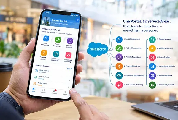
What Was Delivered

Tenant Portal and Salesforce service areas

The engagement produced a complete, developer-ready design handover:

  • 720+ designed screens and frames across the full tenant journey.
  • 34 fully documented, end-to-end service flows spanning 12 service areas.
  • A documented design system: typography, colour, spacing, corner radius and iconography.
  • 99 reusable components (24 Salesforce/SLDS + 75 custom), cataloged for ongoing use by the Salesforce delivery team.
  • Full Desktop & iPad responsive experiences.
  • Interactive, clickable prototypes and a master Figma file, handed over alongside a structured handover summary document.

Anticipated Impact

The portal has completed design and handover and is moving through development ahead of launch, so usage data isn't available yet. Once live, it is expected to:

  • Replace fragmented, email-based coordination across 12 service areas with a single self-service system tenants can use directly.
  • Give tenants real-time visibility into requests, approvals and payments they previously had to chase by phone or email.
  • Reduce the manual coordination burden on internal teams by routing tenants through structured, guided workflows instead of unstructured email threads.

Why Codelattice

Projects like this succeed or fail on translation turning dense, department-specific operational knowledge into something a tenant can use without training. That meant sitting closely with the client's own service documentation, not just wireframing in isolation, and being just as rigorous about the underlying workflow logic as about the visual design.

A few things defined how the team approached it:

  • User-centered design grounded in the client's real operational documents, not assumptions — every one of the 34 flows traces back to an actual documented business process.
  • A design system built to scale, not just to launch — the 99-component library means the next service the client adds won't need a redesign.
  • Close collaboration with the client's business stakeholders and the Salesforce delivery team, so the design handover was implementation-ready rather than aspirational.
  • Structured, thorough documentation — sitemap, design system, component catalogue and flow-by-flow reference — built for a smooth handover and long-term maintainability.
+919620615727
919620615727

We work with global brands from startups to enterprises. Let's talk